IT IS TIME TO CHANGE THE WAY YOU THINK ABOUT YOUR WEBSITE
I continue to see innkeepers searching for the holy grail of website design. I hear them asking questions like, “Who is the best?”, “What company will build me a Mercedes Benz of visual eye-candy?” In return they are willing to pay tens of thousands of dollars to own their site, while others find themselves paying expensive monthly fees to lease a site indefinitely. They search for a provider who will build them the most lavish, fancy, window-dressing-style design thinking this is the answer to obtaining more direct bookings.
And though this tactic may have worked in the past, things have changed.
If you are in the market for a new website, I hope that this article will shed light upon what is important when it comes to website design in today’s online world.
MOBILE FIRST
Now that Google has forced all businesses to provide a responsive website design, the first question you need to answer is: How many of your customers are looking at your website on a mobile device?
Considerations when discussing a quality responsive design include a site that is quick to load. It must be easy to use and flow naturally from the desktop version to the tablet version and finally onto a mobile device. In other words, call to actions are visible and easy to use, content is abbreviated with "read more" links, photography is sized appropriately, etc.
So how do you know how much of your clientele is using your website on a mobile device?
To answer this question, you must log into Google Analytics and find out!
Step 1: Log into Google Analytics https://analytics.google.com/analytics/.
Step 2: In the left-hand column, click on Audience >> Mobile >> Overview
Step 3: Set the date using the calendar in the upper right-hand corner.
Hint: Searching a year at a time is preferable to see the trends changing from Desktop to Mobile.
Step 4: Look at your Mobile Sessions % -- See in the RED circle below…
Important Note: Many of your guests who initially find* you on a mobile device appear to wait until they are back at their desktop to make a booking. Which leads us to the usability of the booking engine? But that is another discussion altogether!
You will be able to see this trend by looking at your Transaction and Ecommerce numbers in Google Analytics – See in the RED box below.
* Micro Moments
What do you do when you have a few minutes to spare at a doctor's appointment, or are waiting to pick up your kids at soccer practice? You surf on your phone. Google calls these touch points “Micro Moments”. Your guests are no different. Micro Moments allow them to search and dream of their next getaway. The question is – is your site built to satisfy the mobile users' needs during these Micro Moments?
THINGS TO THINK ABOUT
In the example above, this particular innkeeper is seeing 75% of his session visitors (traffic) coming from a mobile device. A whopping 75%! That means that ¾ of visitors to his site are looking at his mobile responsive display, and not his desktop.
Which brings us to the next AH-HA moment to consider....
MOBILE DISPLAYS ARE PRETTY MUCH ALL THE SAME
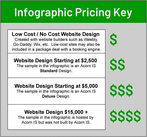
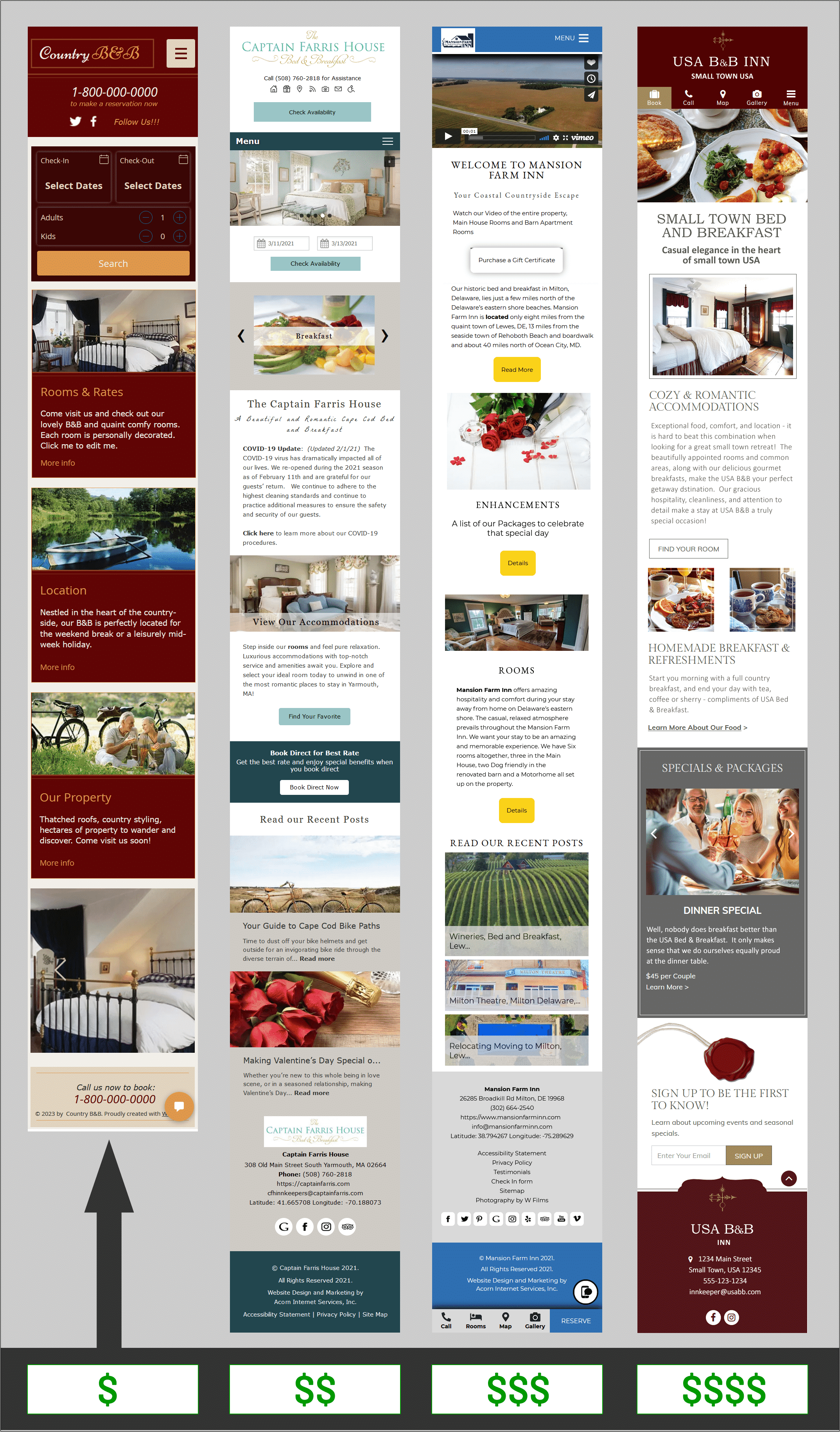
Yes – you heard correctly. Mobile displays are pretty much all the same. Let us take a moment to do a deep dive on responsive website designs from Low-Cost / No-Cost DIY (Do-it-yourself) designs to $$$$ as seen on a mobile device. When you boil it down all websites look pretty much the same on a responsive mobile display. See the info-graphic below.
SO, WHAT DOES THIS MEAN FOR YOUR GUESTS?
Over the past few years, the mobile user experience has been defined. Your guests know what they expect to see on mobile, and deviations from this norm may result in a loss of a booking. This is why all Responsive Mobile designs are pretty much the same.
Not convinced? Take a look at the image below to compare mobile designs from Low Cost / No Cost to Higher Cost designs and see if you agree.
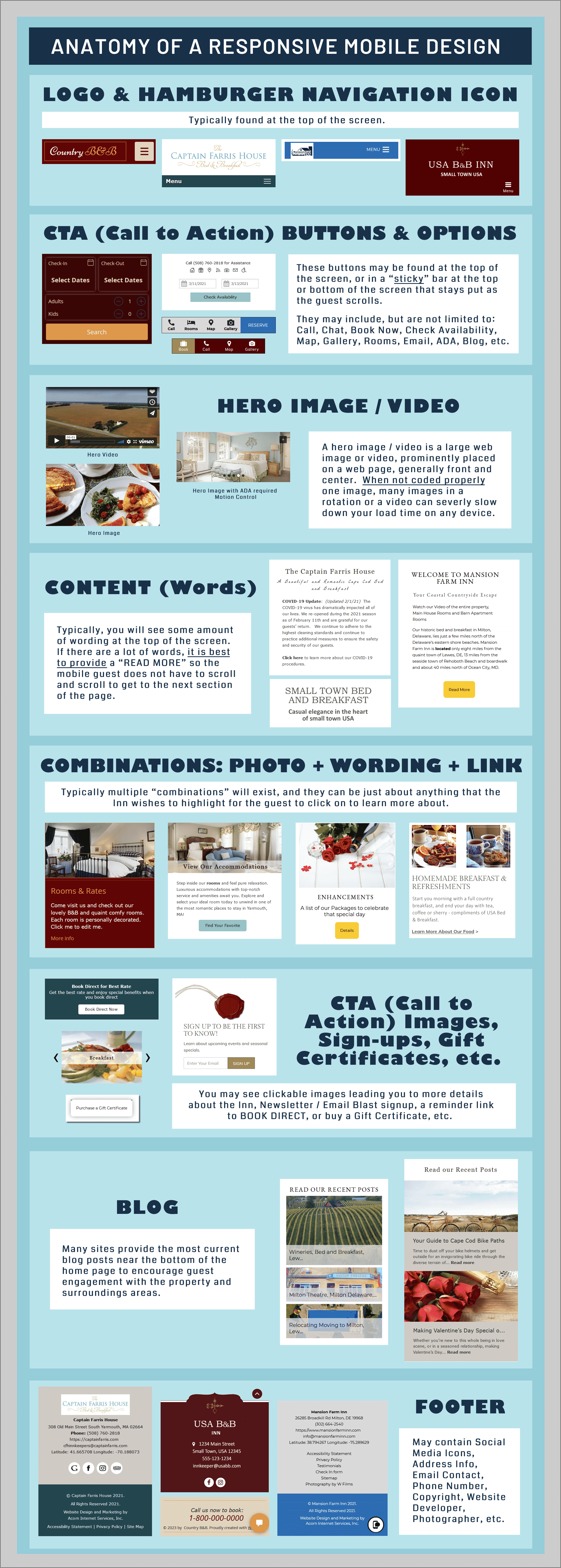
THE ANATOMY OF A RESPONSIVE MOBILE DESIGN
Let’s take a look at the different parts that are typically found in any lodging mobile display.


Notice that the more expensive site has multiple types of artistic elements such as lines around the images, a curve in the footer area, etc. But are these features necessary for your mobile guest to make the decision to book with you over a competitor?
The question you must answer is: Are these artistic items as seen on the mobile display worth the additional cost to design? Are they worth more than the least expensive options? Or should that money be put to work for you elsewhere? Maybe Yes? Maybe No? Since no two properties are the same, a thorough investigation is needed to answer this question for your individual property.
Every innkeeper who is looking to build a new site will need to investigate and consider the following Five (5) Steps when choosing the provider to build their BEST FIT design.
WHAT IS YOUR BEST FIT DESIGN?
Especially now, as many Inns are starting to recover from the impacts of COVID, you may be in search of ways to grow and reestablish your business. And you may be considering a new design. But what is the right design for you?
We advise our clients in the following way:
1) Know your audience.
Do you have more mobile users than desktop users? How has that trend changed over the past 3 years? Should you concentrate your efforts on Mobile or Desktop? Or should you split between the two? Are more guests booking on Mobile or on Desktop?
Hint: Google Analytics will provide you this data.
2) Know your competitors.
What level of visual appeal are you competing with? Look for the top visual designs of your competition and keep those in mind as you decide how to proceed with your new design.
3) Determine your budget.
Do you want to pay a monthly fee to lease a site? Do you want to pay a monthly fee to own the site over time? Do you want to pay in full? Keep in mind that over-time payments with a promise for an updated design every 2-3 years will have little impact to the mobile display.
4) What will you be happy with?
For those of us with an artistic eye, being inhibited by facts and budgetary constraints is not easy. You will need to do your best to balance those factors as you strive to create a design that you will be happy with into the future, and at the same time, one that will benefit your business (grow revenue).
5) Don't forget to look under the hood.
Moving beyond visual appeal, not all websites are created equal. Plus, your decision should not be made on window dressing alone. In the next section, Beyond the Window Dressing, we will share a list of items that must be included in all quality website designs.
Hint: You should test each of these items on other websites the provider has already created before making a decision.
BEYOND THE WINDOW DRESSING
We have spent a good deal of time talking about how a website LOOKS. But it is even more important to know what is under the hood of a website than how it looks! A beautiful visual design does not automatically ensure or equate to a quality website.
It is easy to determine if the visual side of a website appeals to your artistic nature, but digging down to the foundational code level of a website is not so simple. Fortunately, there are tools at your disposal to test the quality of the code that supports the visual design.
WHAT ARE THE "UNDER THE HOOD" REQUIREMENTS FOR A QUALITY DESIGN?
A quality site must:
- Be ADA compliant.
Hint: Just adding the little accessibility icon or button does NOT make your site ADA compliant. It must work with a screen reader for a blind user, including keyboard only navigation for users who are unable to use a mouse. It must also provide a motion stop button for users with motion sensitivities, and have captions and transcripts for those with hearing impairments, etc. - Provide a responsive layout for all device sizes.
- Meet Google’s speed requirements and load time expectations of your guest.
- Meet Google’s Page Experience requirements.
- Contain proper on-page SEO (Search Engine Optimization).
- Provide proper Local SEO and UTM tracker support.
- Include accurate, error- and warning-free rich snippet / schema code.
- Include correctly installed Google Analytics / Tag Manager with E-Commerce Tracking.
- Connect to Search Console.
- Provide connections to 3rd party software.
- Etc.
BOTTOM LINE
You will want to choose a web designer that is qualified to create a site that is going to meet all the various guidelines that must be followed. The more java-script, bells and whistles, 3rd party connections, videos, photo rotations and widgets that is added to your responsive mobile design, the heavier your site will become, and the slower it will load. The same goes for the “under the hood” foundational code that is supporting all these bells and whistles. If it is poorly written, or is missing items that should be included, this too will impact load time. The slower the site loads; the fewer visitors are going to see it - because they simply will not wait.
FEWER VISITORS = LESS REVENUE
NEED HELP?
We are happy to help if you are unsure of your next steps regarding your online marketing. Whether it's choosing the right style of website design, helping to test your current site to see if meets the "Under the Hood" guidelines, or learning how our Advantage Plan and Marketing Services can help grow your business, we can help.
NEXT TIME
This post is an introduction and background article for a more important topic, “Google Strikes Again! Enforcement of Page Experience guidelines is on the horizon – How does your website score? R U ready?”
Stay tuned!


Always informative and ahead of the curve! Early on I was looking for the Cadillac of websites but after Acorn educated me on the importance of performance etc… I was sold. It can be overwhelming at times but Lisa and all staff are there to walk you through it. Thank you!!