"The Acorn Team is Always Two Steps Ahead!"
– Brigette Walters
Read Full ReviewAcorn Marketing
Acorn Marketing Navigation Menu
Make an Impressive First Impression
Acorn Marketing specializes in responsive website design and marketing for small lodging properties, including B&Bs, inns, cabin rentals, boutique hotels, and wedding venues. We take website design seriously because your website is your chance to make an impressive first impression. Wow them the moment they arrive at your site with an Acorn website design.
Skillful website design doesn’t stop at a pretty face. That’s why each of our responsive website designs meets Google’s schema, page speed, usability, mobile-friendly and SEO guidelines, including ADA accessibility.
Take time to browse through our design portfolio below. We offer five design options based on your needs, from a standard plug-and-play option to a custom design built from scratch. Some designs have similar layouts, but each one will differ in size, functionality, and features. Your branding, budget, and availability will ultimately determine which design is the right fit for you. Let Acorn build it, and guests will come.
Each type of Responsive Design Package (Standard, Deluxe, Custom and Premium) has an established Base Number of Web Pages in the Bid Estimate. Clients may choose to have Acorn Marketing add in additional Pages as part of the Sales bid process, or they may add them in themselves using the included WordPress CMS after the site has been completed.
Suggested pages may include:
All our Responsive Web Designs are built on a “Core” set of code. You can think of our “Core” code in relation to the engine in your car. Acorn Marketing has invested 100s of hours of R&D (Research and Development) into this “Core” code to make sure it follows Google’s Guidelines for Schema, Mobile, SEO, Speed, ADA, GDPR and Usability. The Layout, or Theme (the Look and Feel) of the site sits on top of the “Core” code. You can think of the Layout or Theme as the body of your car. Our New Standard Design is a lower cost, plug-and-play option to give you all the power of our “Core” with a current look and feel. Our Deluxe Plan offers the ability to choose from any of our Themes and alter them to your specifications. Finally, we can create a totally Custom Design as per your specifications, still using our “Core” code, but have a one-of-a-kind-look-and-feel as part of our Premium Plan.
SEO stands for Search Engine Optimization. We will not build a Responsive Web Design without On-Page SEO as per Google’s SEO Guidelines. On-Page SEO includes: Titles, Descriptions, Corresponding Text provided by the client and modified by our Technical Editors, Header Tags and Internal Links per each marketed page. If you are unsure about what SEO really is, and why it’s required by Google to be included in your Responsive Web Design, we invite you to watch the most recent Quarterly SEO recorded webinar to learn more. You may request access to this recorded webinar by emailing education@acorn-is.com.
Google has told all Web Developers and Business Owners that Responsive design is Google’s recommended design pattern. As the very first company in the Bed and Breakfast Industry to build only Responsive Designs, Acorn Marketing is THE premier leader for Responsive Web Design in the lodging arena. Our Google Insights scores consistently exceeds anyone else in our market, and all of our Responsive sites meet Google’s guidelines for SEO, Mobile, Speed, Usability and Schema. If you are unsure of what it means to have a Responsive Web Design, watch the video at acorn-is.com/responsive to learn more.
A Professional Responsive Design requires Professional Photography. Today, Web Design includes very large imagery on the pages to better “sell” the property to your guests when they are visiting your site on a PC, Laptop or Tablet. On a site built by Acorn Marketing, that same imagery is sized down appropriately to load quickly on a mobile device. Poor Photography will severely impact your ability for us to design a highly effective Web site. If you need suggestions fir Photographers in the lodging space, we encourage you to check out our list of Affiliate Photographers.
Google has provided Speed and Usability Guidelines for both your Desktop and Mobile site. They have also provided a variety of testing tools to allow business owners to know whether their Web site meets those guidelines. One of these tools is called Test My Site with Google. The other tool is WEBPAGETEST.org. There are 3 color codes as part of this test. Green: Good, Yellow: Acceptable, Red: Bad. At this time Google advises that although striving for Green scores is the best choice of action for the web developer, if your site requires a plug-in, widget or other feature that causes your speed to drop into the Yellow zone, it’s better to provide that feature to your guest, than remove it to score higher. We strive to do both, but realize that from time to time such features, widgets and plug-ins that a Business Owner or Manager wants and needs for their clients simply have not been designed to meet these speed and load time guidelines, thus when imported into the site, drop the Speed scores. We do suggest, when possible, going to the developer of such features and requesting that they improve their scores, so our Web site score can improve also. But if the provider of the feature cannot or is unable to, adjust their feature’s code, we must then settle for whatever score is derived. Some examples of such features, widgets and plug-ins are: Translator plug-ins, Reservation widgets, Review widgets, Photo Sliders, etc. These are all items that are not an intrinsic part of your Web site but are imported from a third-party provider to handle a feature or function you need to have for your clients.
On November 18, 2014, Google provided all Business Owners and Web developers the Mobile-Friendly Testing Tool. This tool allows you to test each of your individual web pages on your Web site and Blog to see if Google thinks the page is “Mobile Friendly”. At this time, the words “Mobile-Friendly” began showing up on all Mobile SERPs if your page had been found by Google to be Mobile Friendly. On April 21, 2015, Google took Mobile-Friendly one step further, and began placing your site in the Mobile SERPs based on whether your site was Mobile-Friendly or not. All of our Acorn Responsive Web site designs are Mobile-Friendly.
All of our Acorn Web designs include either the basic Google Analytics install, using your current UA number from your previous site, if one existed, or the more advanced version of E-Commerce Tracking. If your Reservation Software supports E-Commerce Tracking (not all Reservation / Booking companies do), you will need to check with your choice of Booking software, and tell your Project Manager during the pre-development phase of the project which type of install you prefer. Do note that the reason we keep your current UA number from your old site is so that you can compare improvements or changes in your traffic once the new site goes live. Some companies change out your UA number, and you lose all your old statistics. We are very careful to keep all your previous tracking data, so you can make valid comparisons into the future based on the new site vs. your old one.
All our Responsive Web sites include the installation of Google Search Console. Search Console is a free service offered by Google that helps you monitor and maintain your site’s presence in Google’s SERPs. Search Console helps us understand how Google views your site and allows us to optimize its performance in the SERPs. Basically, Google’s Search Console will TELL YOU what is wrong with your site, and offer suggestions on how to fix those issues.
There are two sides to ADA (American Disabilities Act): Website and Physical. All of our designs, starting in 2018, include ADA Website code and testing to pass both the achecker.ca and the Chrome Accessibility testing tool. We can only control the website code. If your Booking Engine is not compliant, your scores will be lower on these testing tools, as your Booking Engine is integrated into your website. All websites must be ADA compliant in order to attempt to avoid a lawsuit. We also include client provided content for the Physical side of the property also, whether or not a property is exempt, integrated into the website.
All of our sites include a link in the footer to the Innkeepers Privacy policy they provide to us. The content of the Privacy policy should be on both the Inn’s Website and Booking Engine. Additional GDPR considerations may be discussed, at the property owner’s request, at the time of the bid.
All our Responsive Web designs are built using the WordPress CMS. CMS stands for Content Management System. This, in layman’s terms, simply means that once the site is complete and online, you, the Innkeeper or Property Manager have the ability to add pages, change photos, change text, etc. on your own. Please do note, that if you prefer NOT to make changes to your site, we do have a support team that will do it for you based on our current support rates. WordPress is accepted World-Wide as one of the best CMS systems available today. But a word of caution. Hosting of a WordPress site requires on-going maintenance by your hosting company or webmaster. WordPress is an Open Source product, and as such, is a target for hackers. WordPress software is much more stable than it has been in the past, but still requires that your host or Webmaster continually apply security patches to the actual WordPress system itself. This is why we require any new Responsive design be hosted with us for the first year. As part of your hosting fees, we handle all these security patches for you, keeping your site safe. If you decide to move to another host to save money on hosting fees, make sure they are going to handle these ongoing patches for you. Without these ongoing security patches, your site will become vulnerable, and a vulnerable site is easy prey to hackers. The clean-up to having been hacked is much more costly than choosing a responsible and proactive host that actively keeps your Web site safe in the first place.
Every Responsive Web site Acorn IS develops includes a Blog feature. A Blog is a Web log of “LIKE” Information. Blogs are written by one author, but each entry may be commented on by the public (or not). Our Blog feature becomes an extension of your Web site and is referenced from your Web site. Blogs allow Innkeepers and Property Managers to continually post fresh content to Google as per Google’s SEO Recommendations. Consistent posting of fresh content online will support your online placement in the SERPs.
In order to better support your placement in the Local SERPs, we make sure to include a Google Map that correlates with your Google My Business Listing. This map is typically located on the Find Us / Directions page of the site.
Google uses a variety of triggers to determine placement, in fact over 200 of them. Driving Directions are included on all new Responsive Designs as a way for Google to better determine placement in the Local SERPs.
A Responsive Design must be developed in such a way to have its navigation display change from a Desktop style navigation to a Mobile style navigation. Also, to provide a quality user experience to your Mobile clients, it’s best not to simply allow your Mobile site to default to the grey window drop-down box. This does not create an enjoyable user experience. All our Acorn Responsive Designs are created to have Enhanced Mobile Navigation with multi-layered, highly functional, Google-approved tap-size buttons that score very well in the Google PageSpeed Insights test.
Social Media Use Button are simply the buttons that LINK to your various Social Media Business Pages for your business. Depending on what type of Social Media your business participates in, they may or may not include Facebook, Twitter, Pinterest, Instagram, etc. These Use buttons may also include links to your preferred review sites and your blog. Social Media Use Buttons are for your guests to click on to view your various Online Social Media Content and to Like or Follow you for future communications.
As part of any New Development Responsive design project, you will be working with a variety of people during the process from start to go-live. Included in the cost of a New Responsive design is both Data Gathering and Development Project Management. Our Project Managers (PMs) will help you gather everything together we need to design the site and properly migrate your online presence from your current hosting company to Acorn Marketing servers. They are your go-to people throughout the duration of the project.
So many Web design firms are only concerned with giving you a new “LOOK” Web site, neglecting many of the other pieces and parts that go into a new site launch. If you do not have a Flawless Migration Plan (one that leaves literally NO ROOM for error) when your new Web site goes live, Google is not going to look on the new site favorably and your placement can drop. Old pages and new pages should not mix in the indexes. They should redirect. A Migration Plan takes a lot of time and effort when done properly; we begin gathering all this data during the Data Gathering phase, even before you start into the Development process. We want to make sure all old files are identified and handled properly when the new site goes live. A simple redirect to the home page from all of the old files is NOT the best way to handle a migration to a new site for highest possible placement, and when possible, we try to match the old site pages to the new site pages one-for-one.
All Acorn Responsive designs include both an XML and HTML sitemap. Most simply, an XML site map is for the search engines spiders to read in order to index your pages and a HTML sitemap is a general overview of the site. Typically a list of all the pages on your Web site that a potential client would care about reading.
All of our Existing Themes support a Home Page rotation of the large header photos. You can choose to rotate up to 7 photos in this space. We use sliders that are Google Friendly, load quickly, and meet Google’s PageSpeed Insights guidelines. You will choose the rotation photos as part of the Pre-Development phase of your project. Additional Header Photo Rotations for subsequent pages are available for our Deluxe and Premium designs, at an additional cost, and may be added to the bid during the Sales process.
You may choose to add additional header rotations to sub-pages (pages other than the home page) on Deluxe and Premium designs for an additional cost. You can chose to rotate up to 7 photos in this space. We use sliders that are Google Friendly, load quickly, and meet Google’s PageSpeed Insights guidelines. You will choose the rotation photos as part of the Pre-Development phase of your project.
All of our Existing Themes support a Photo Gallery option. We use sliders that are Google Friendly, load quickly, and meet Google’s PageSpeed Insights guidelines. You will choose the photos you wish to have in your Photo Gallery as part of the Pre-Development phase of your project. You may choose up to 15 photos in the main photo gallery. Additional photos, and additional Photo Galleries are also available at an additional cost and can be added to the bid during the Sales process.
A new Responsive Design may or may not resolve your placement issues. Many business owners think a new Web site is some type of silver bullet. It is not. There are many things that affect your online placement, especially your Local placement, that have NOTHING TO DO WITH YOUR WEB SITE DESIGN. We created the SEPPIR (Search Engine Placement Problem Identification Report) many years ago to help identify “Digital Baggage” that may be having a negative impact on your Search Engine Placement. Things that Google used to approve or allow are now things that Google will penalize you for today. This report is designed to only IDENTIFY those areas of concern. Once potential problems with your site placement have been identified, an Action Plan to resolve those issues will need to be created and executed properly before any hope of improvement can be expected to be seen in placement. Who executes the Action Plan can be decided at the time of the review call that accompanies this report. Business Owners and Managers, who have time, are quite successful in executing most actions needed to repair placement, but should you prefer, our team can also assist you with this work. It is important to realize that placement issue correction (the Action Plan) may take a few hours, but on the other hand may take hundreds of hours to complete, depending on the amount of issues that need to be resolved. This does not include the time it takes Google to realize you have made the changes and are now waiting for them to adjust your placement. If you do not already have high Organic, Local, Maps and Mobile placement, we strongly recommend that you add the SEPPIR to your new Responsive Site design bid so we can identify additional issues that may preclude your new design from placing a high as it possibly can in the SERPs. Read More
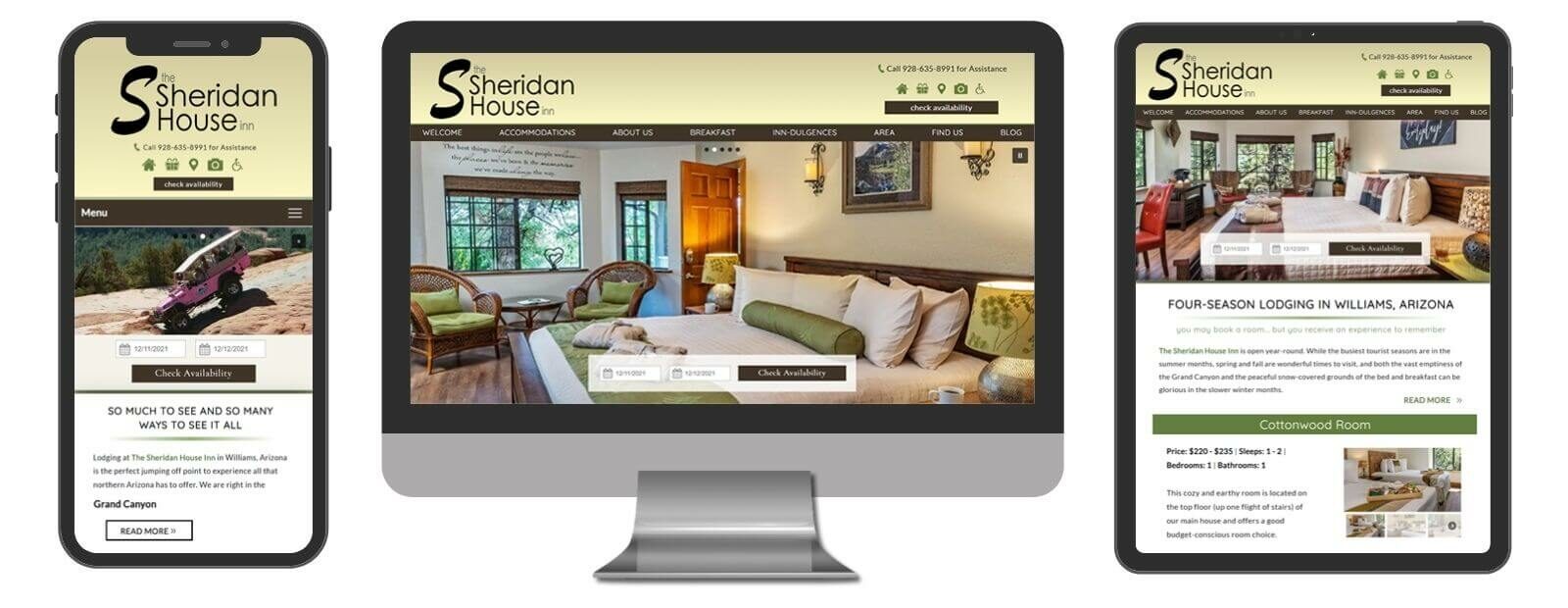
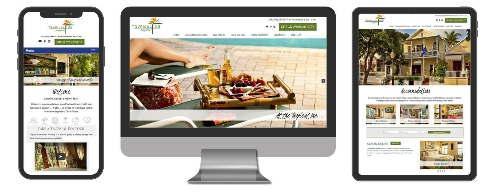
Standard Designs
Our responsive Standard Design is a quality-built plug-and-play option that offers a clean and bright look and feel. There is no customization available on the Standard Design, however you can choose from predesigned choices for text style and color scheme combinations. The result is an attractive, affordable, Google-friendly website that highlights your property’s best features and can go live quickly.
The Standard Design includes:
Standard Designs include ALL of the inner workings (Core) of a high-end site for an affordable price. The base cost includes 12 individual pages (additional pages may be added at an additional flat rate per page). What’s more, YOU OWN THE SITE!
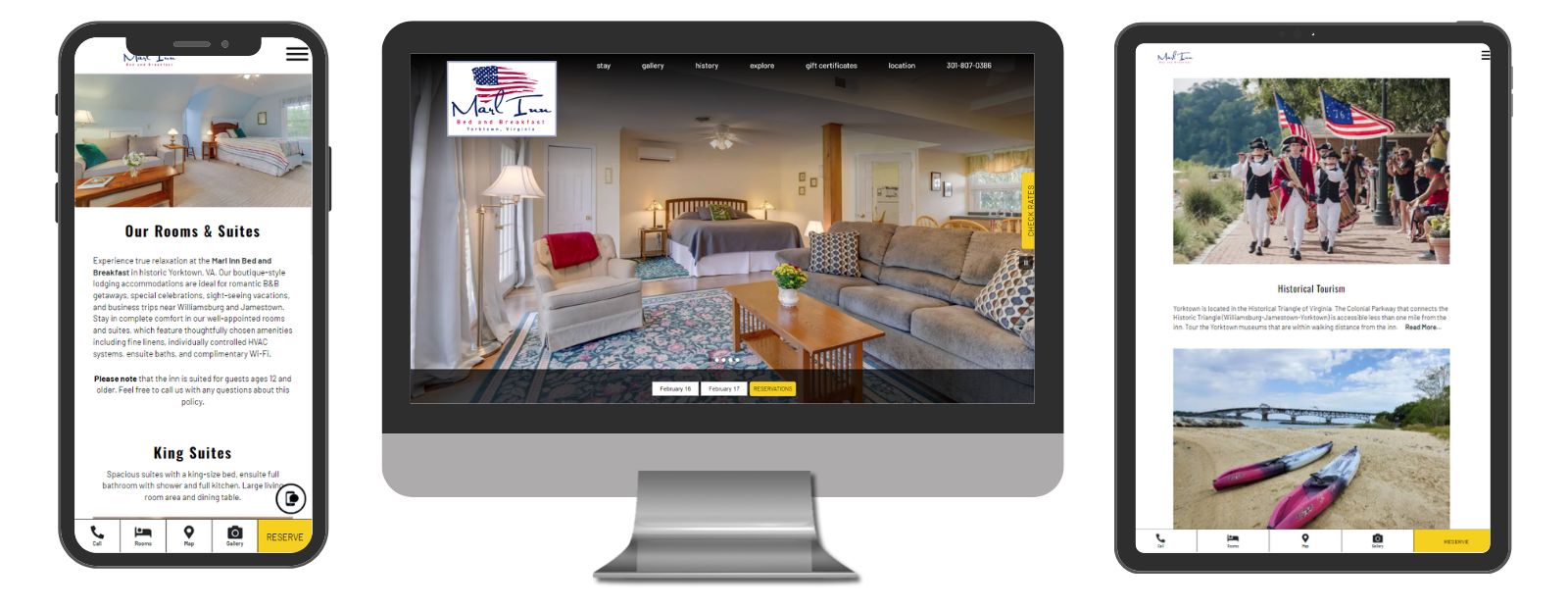
Marl Inn Bed and Breakfast
Yorktown, VA
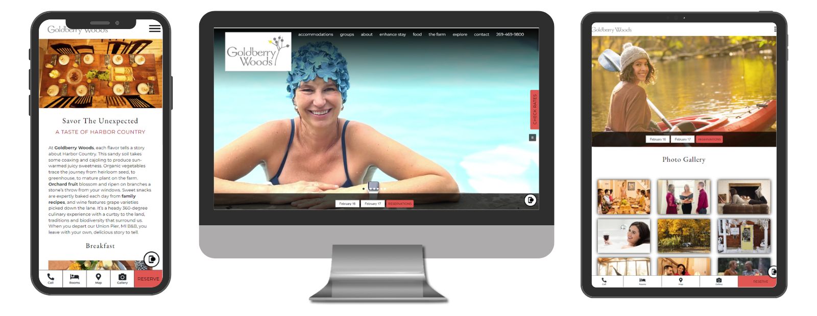
Goldberry Woods
Union Pier, MI
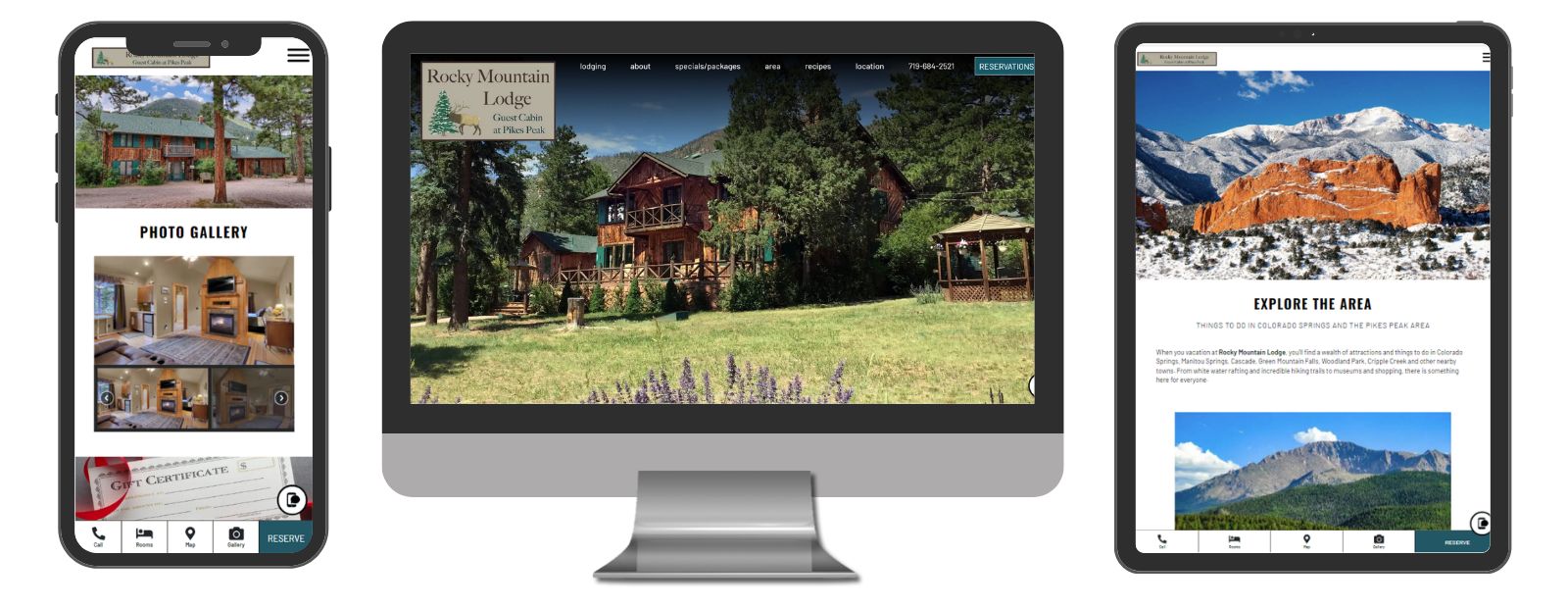
Rocky Mountain Lodge
Cascade, CO
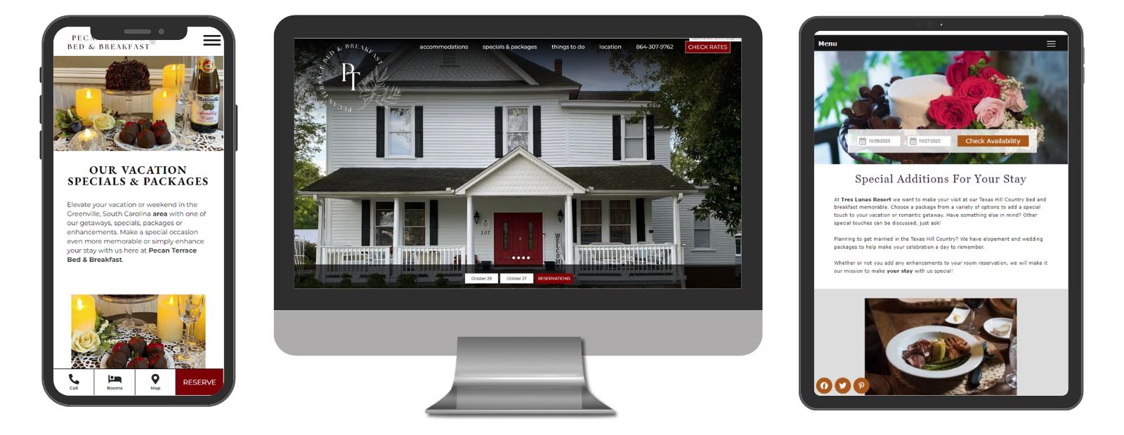
Pecan Terrace Bed & Breakfast
Easley, SC
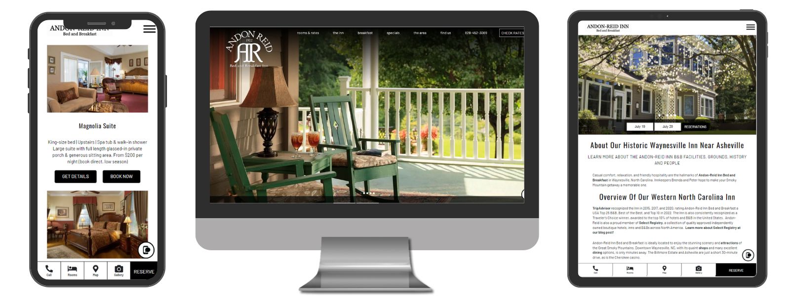
Andon-Reid Inn
Waynesville, NC
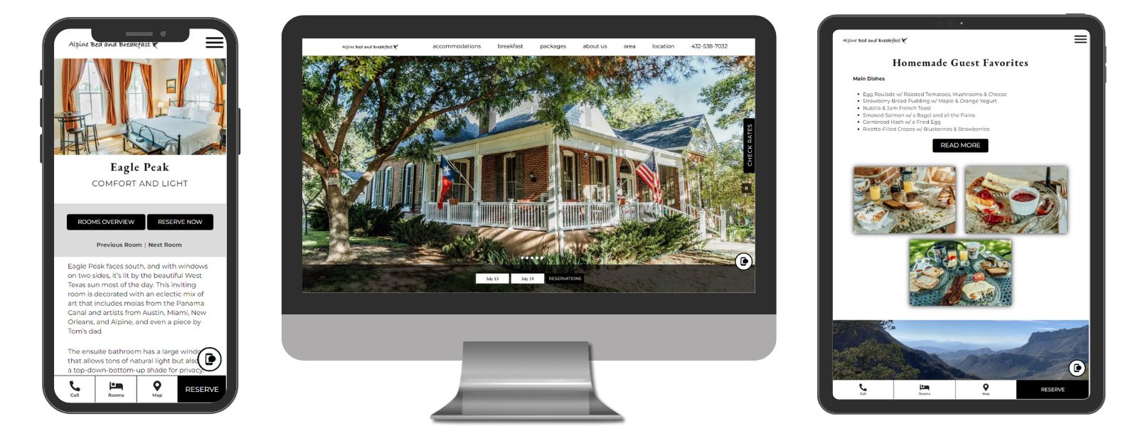
Alpine Bed and Breakfast
Alpine, TX
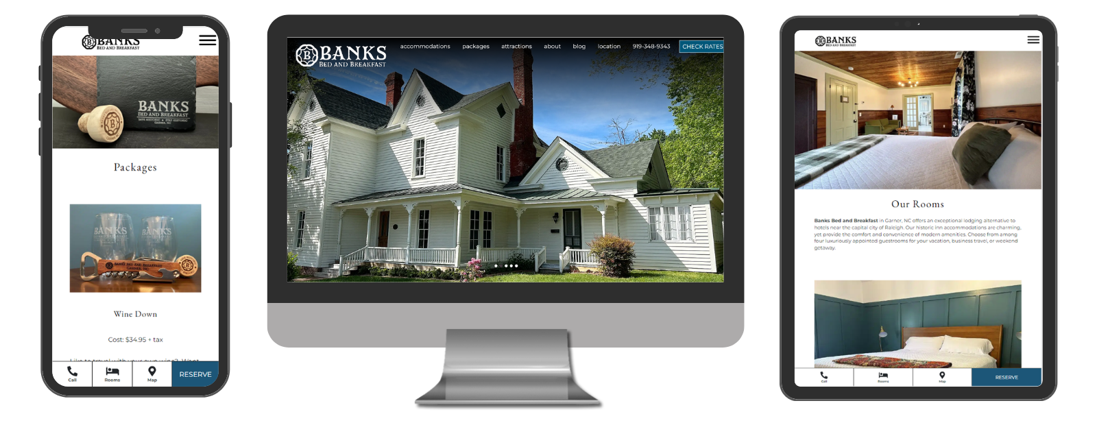
Banks Bed and Breakfast
Garner, NC
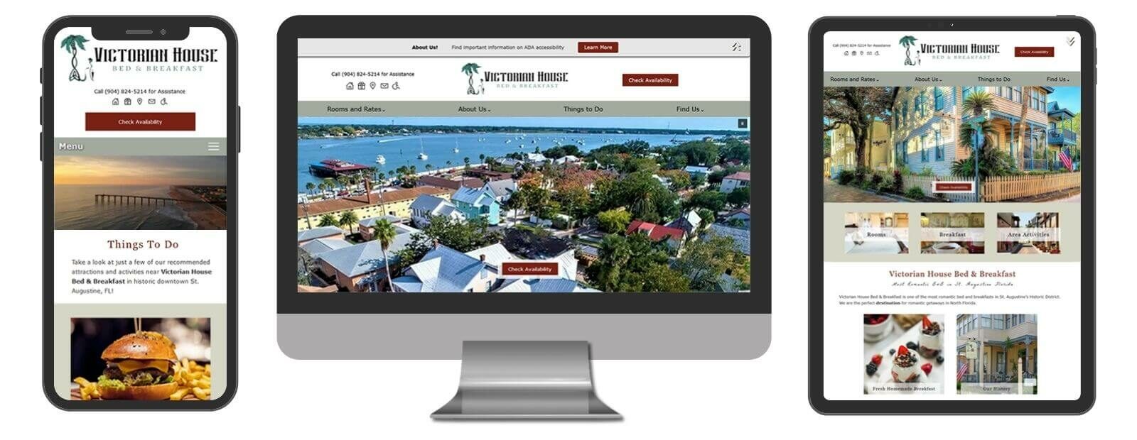
Victorian House Bed & Breakfast
St. Augustine, FL
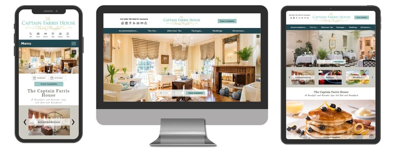
Captain Farris House
South Yarmouth, MA
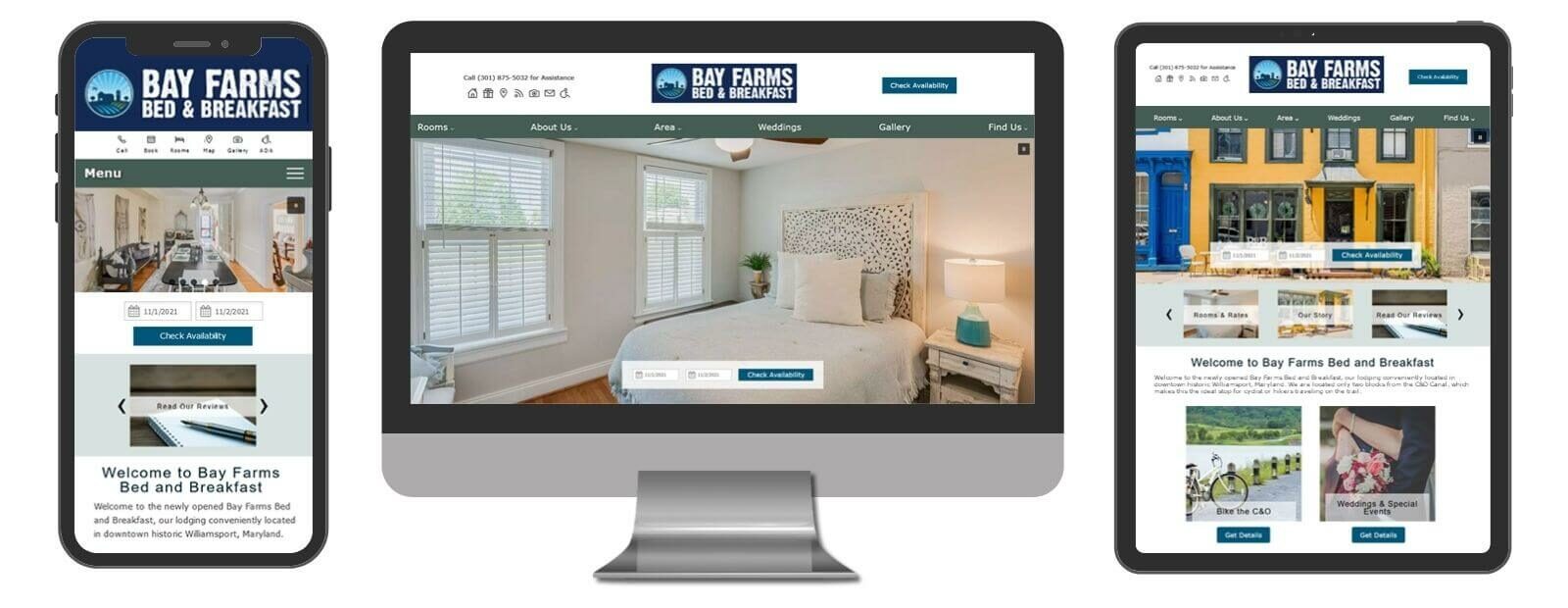
Bay Farms Bed and Breakfast
St Williamsport, MD
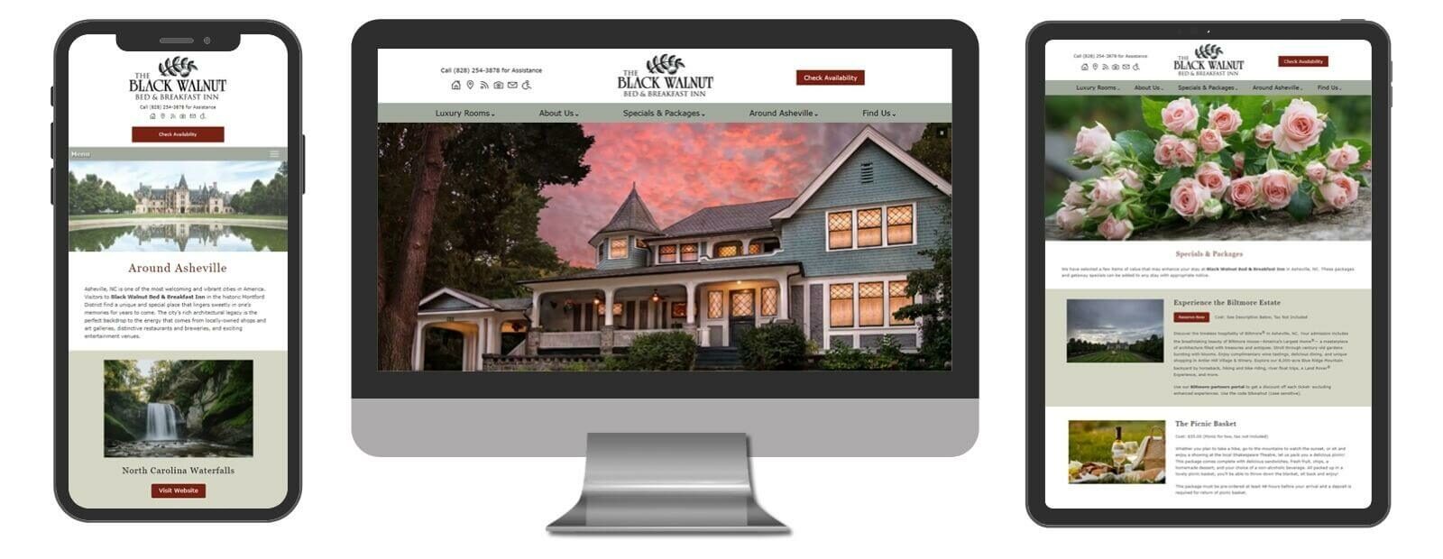
Black Walnut Bed & Breakfast Inn
Asheville, NC
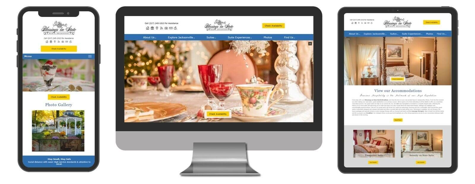
Blessings on State Bed & Breakfast
Jacksonville, IL
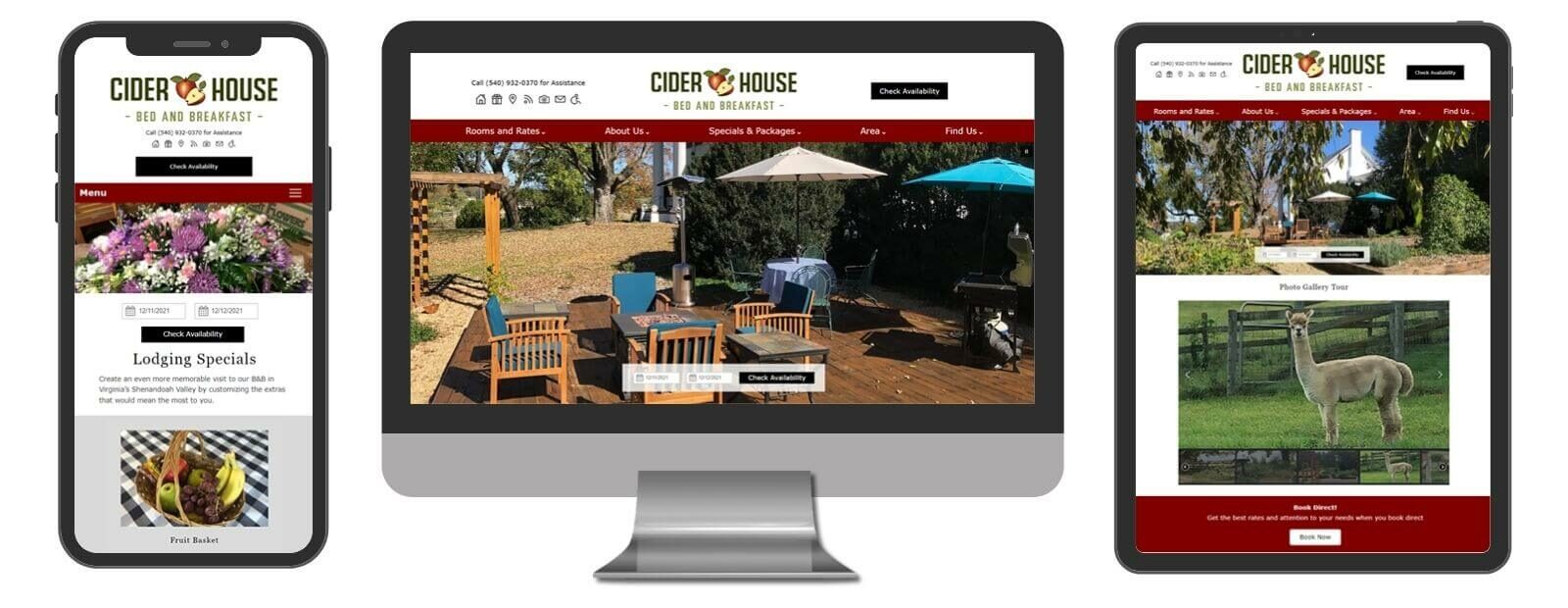
Cider House Bed and Breakfast
Waynesboro, VA
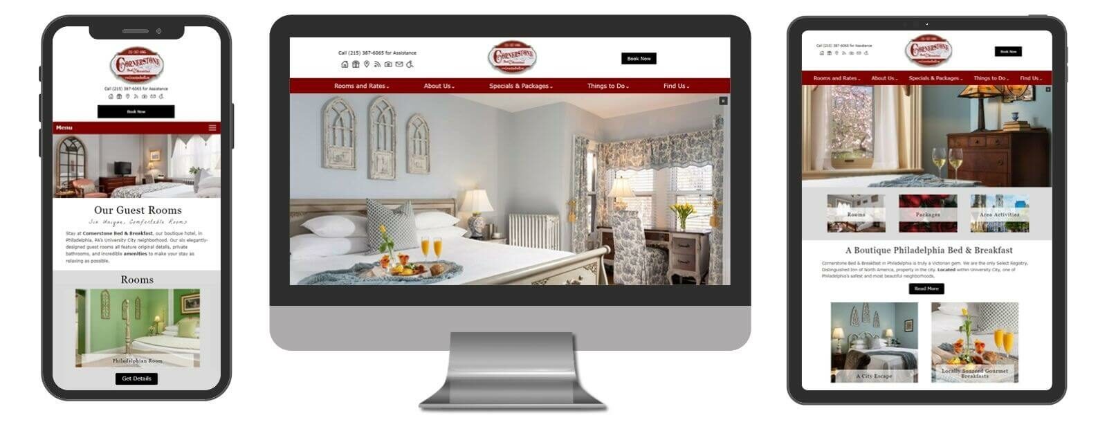
Cornerstone Bed & Breakfast
Philadelphia, PA
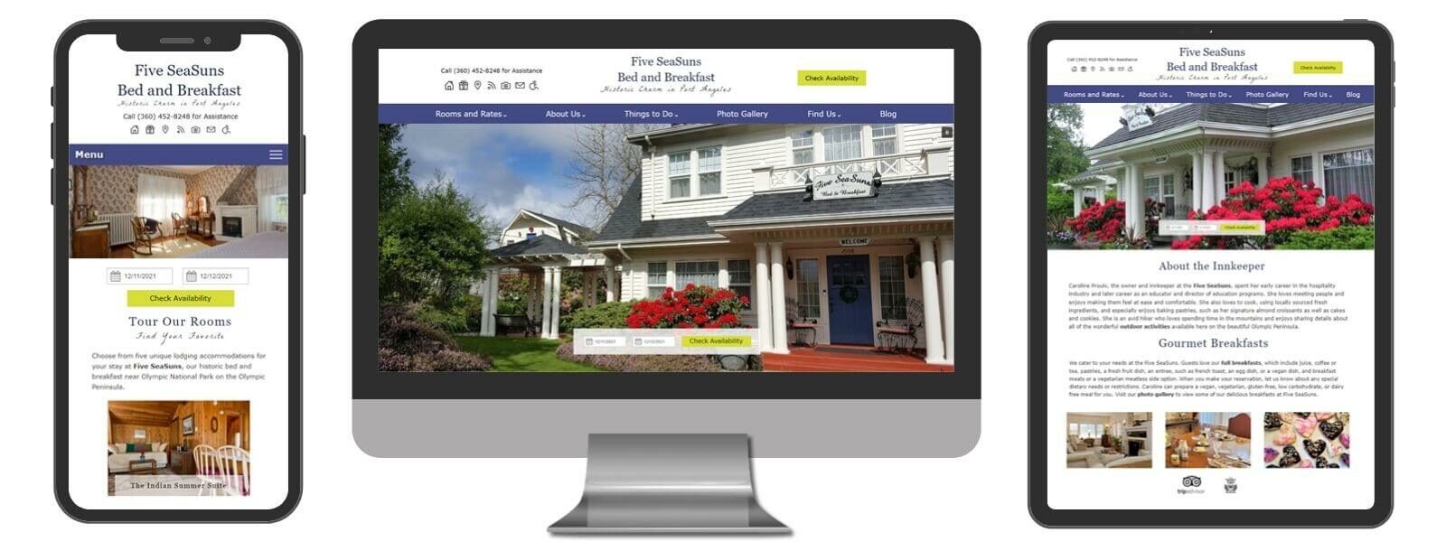
Five SeaSuns Bed and Breakfast
Port Angeles, WA
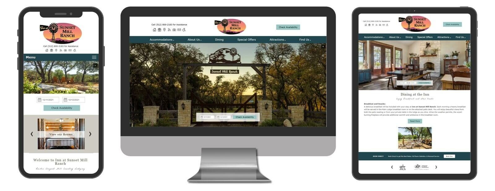
Inn at Sunset Mill Ranch
Wimberley, TX
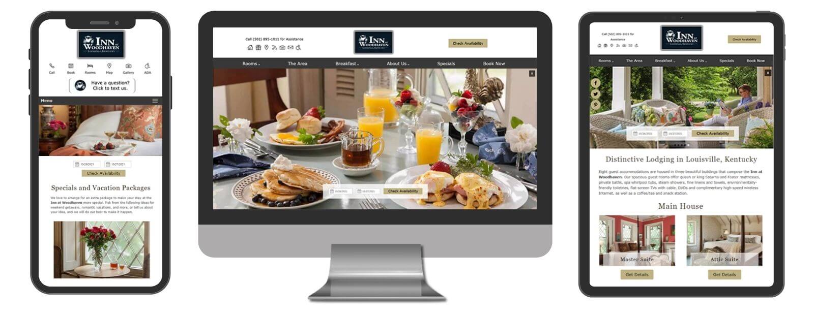
Inn at Woodhaven
Louisville, KY
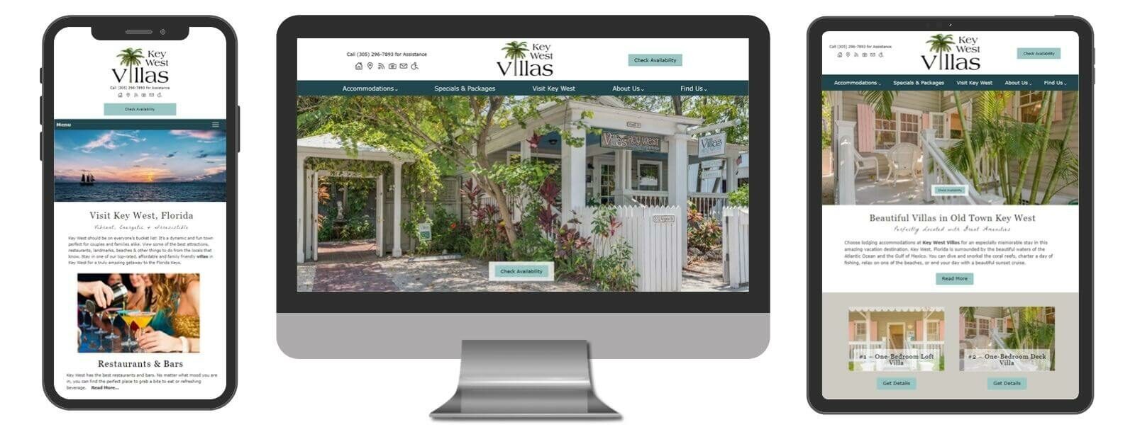
Key West Villas
Key West, FL
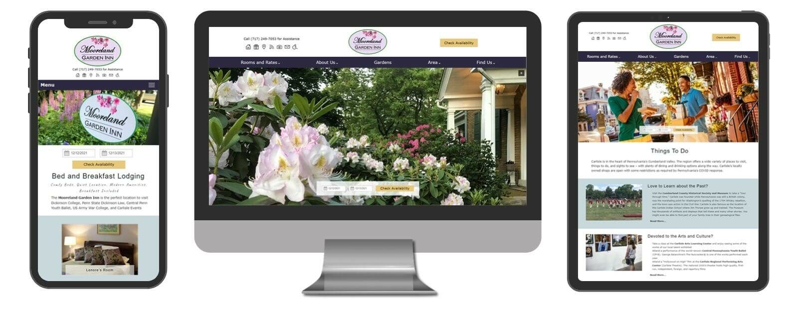
Mooreland Garden Inn
Carlisle, PA
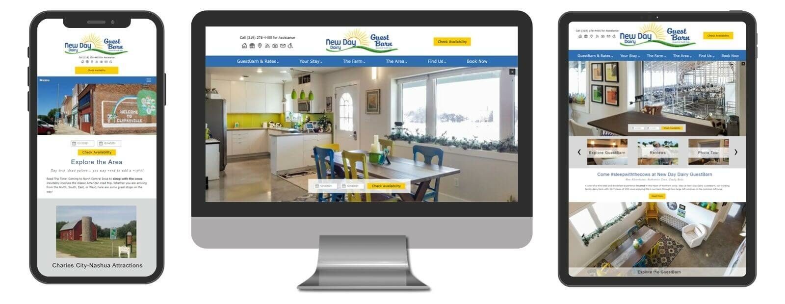
New Day Dairy GuestBarn
Clarksville, IA
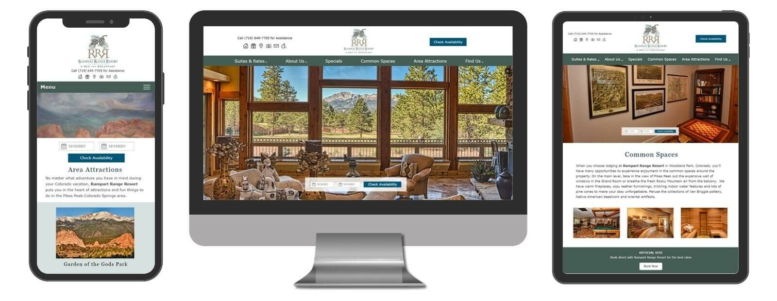
Rampart Range Resort
Woodland Park, CO
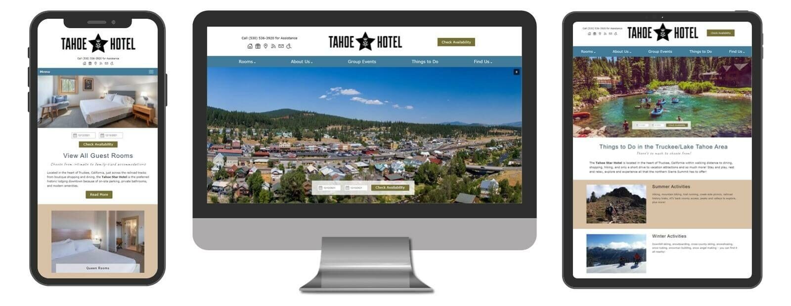
Tahoe Star Hotel
Truckee, CA
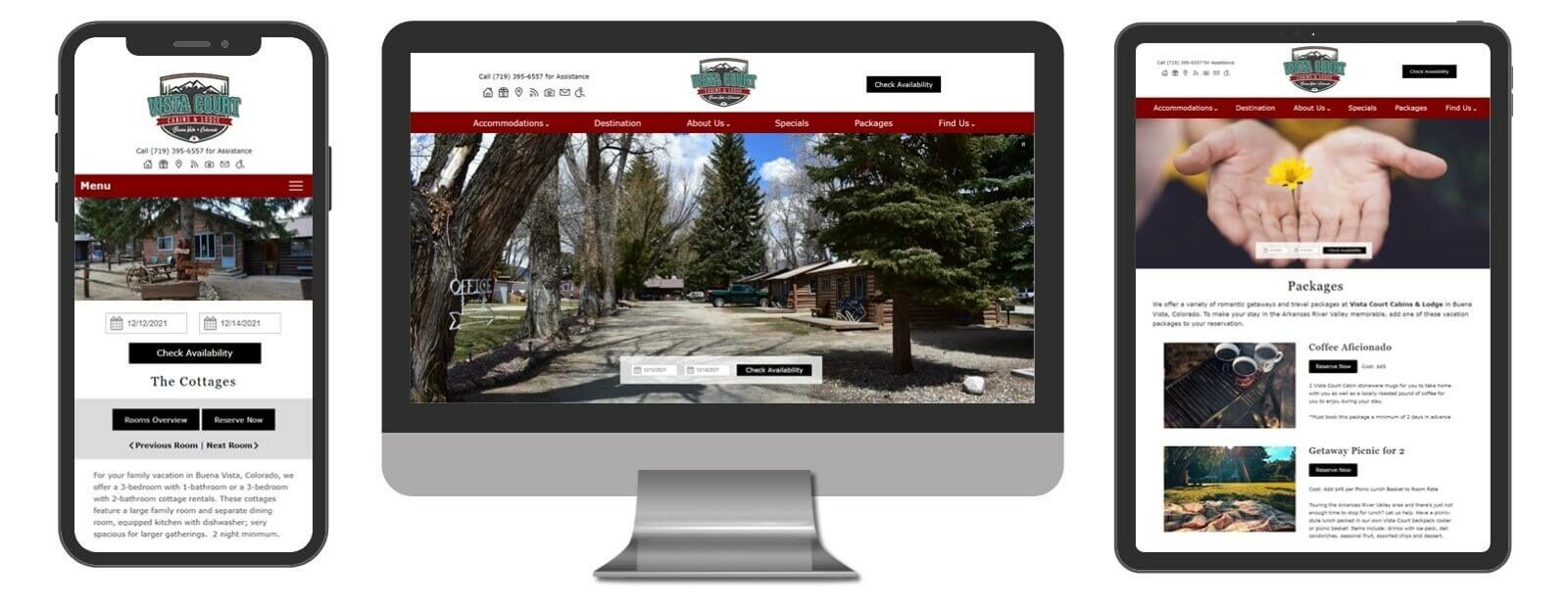
Vista Court Cabins & Lodge
Buena Vista, CO
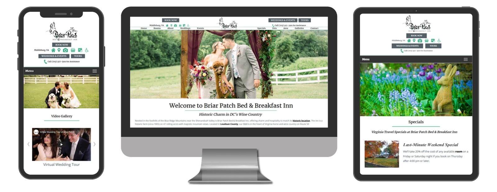
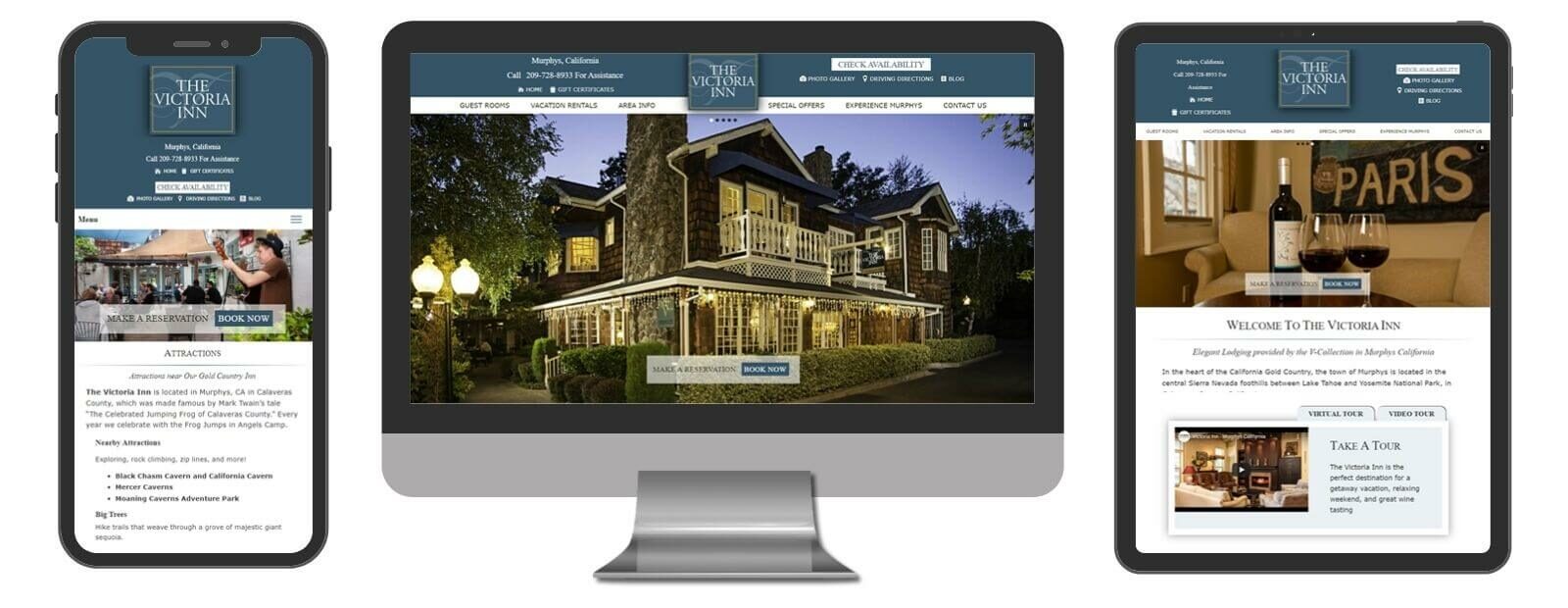
Deluxe Designs
Our responsive Deluxe Design offers a clean and modern approach that goes a step further than our Standard by allowing you to incorporate subtle features and added options. Let your photos speak for you in this contemporary, mobile-first option.
The Deluxe includes 12 individual pages (additional pages may be added at an additional flat rate per page), and our “Core” code base that has been developed to meet Google, ADA, quick-to-load, and other quality guidelines. This “Core” is part of any design developed by Acorn Marketing, and YOU OWN THE SITE!
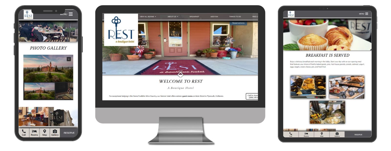
Rest - A Boutique Hotel
Plymouth, CA
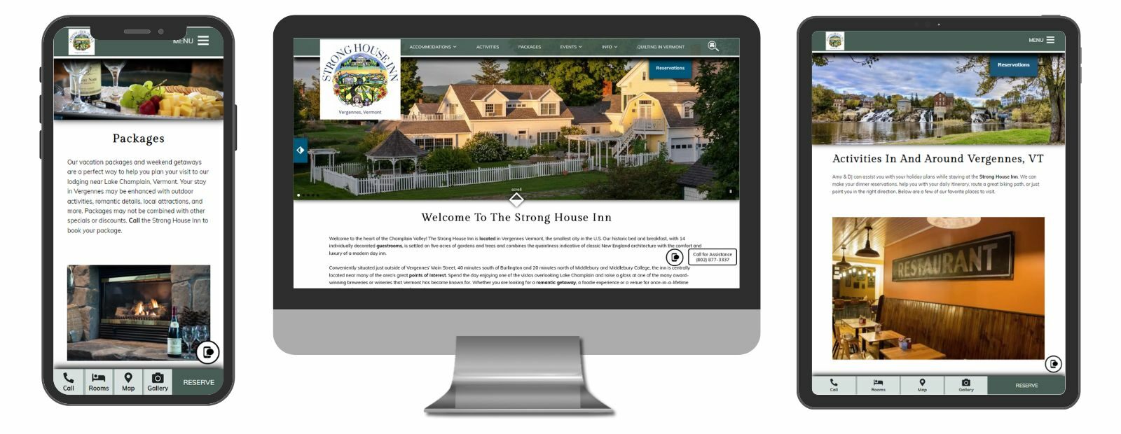
Strong House Inn
Vergennes, VT
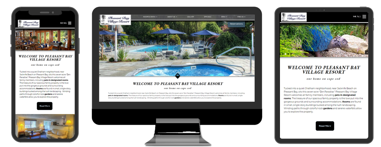
Pleasant Bay Village Resort
Chatham, MA
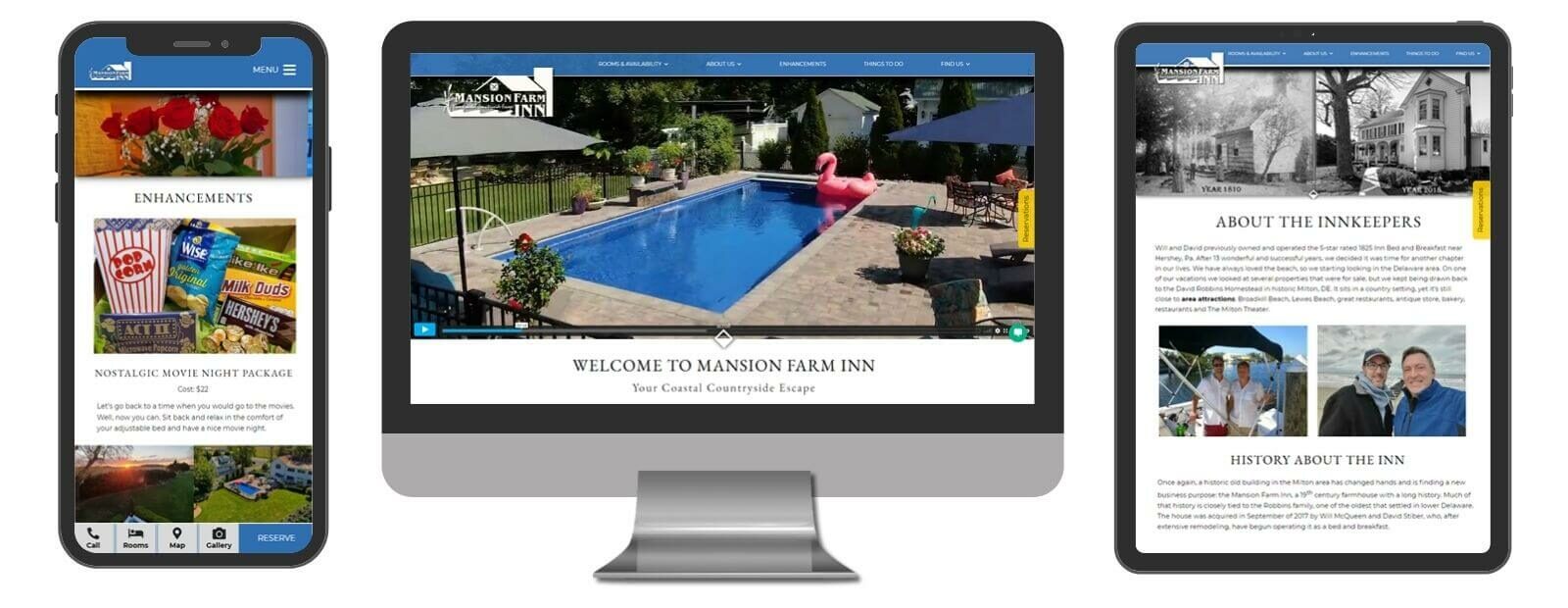
Mansion Farm Inn
Milton, DE
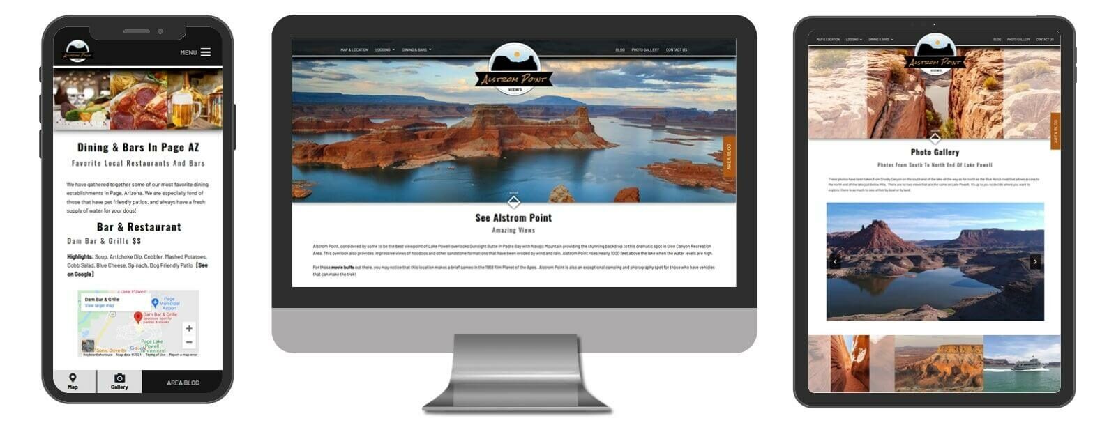
See Alstrom Point
Big Water, UT
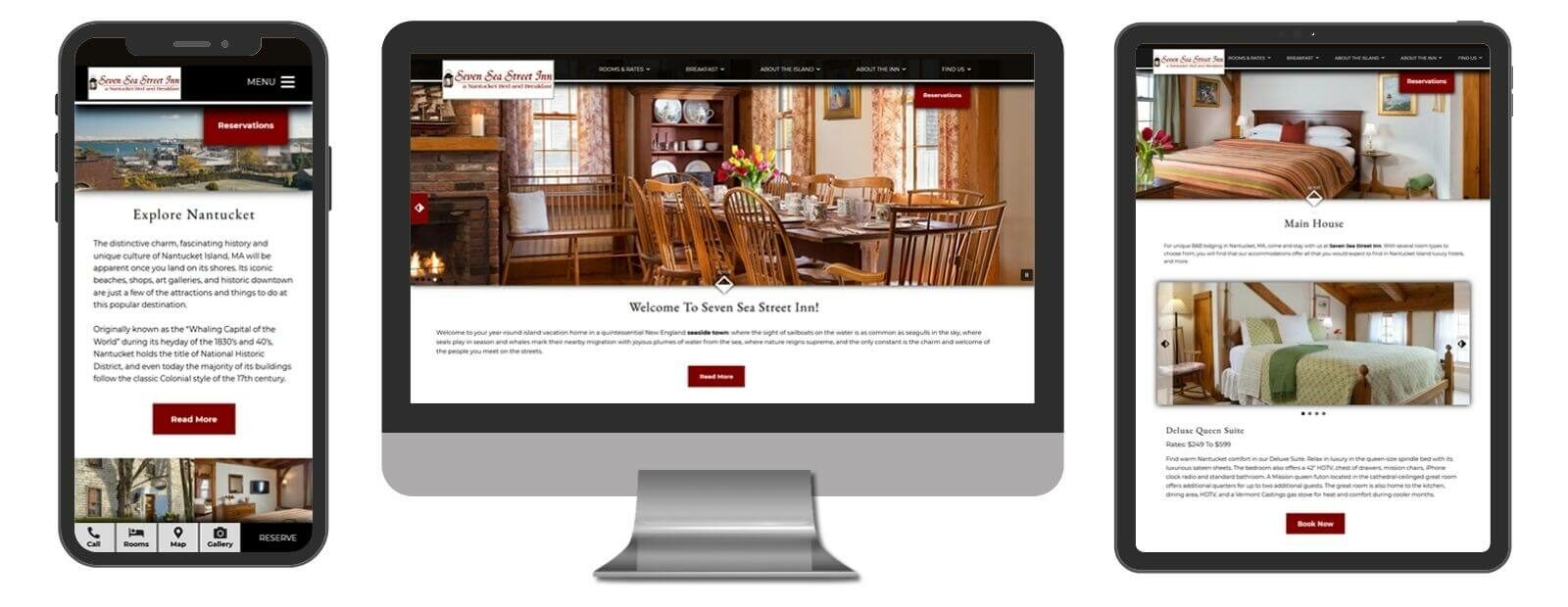
Seven Sea Street Inn
Nantucket, MA
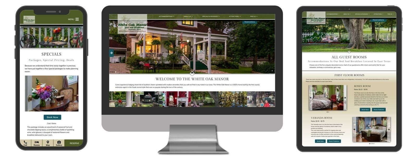
White Oak Manor Bed and Breakfast
Jefferson, TX
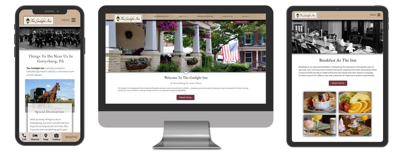
The Gaslight Inn
Gettysburg, PA
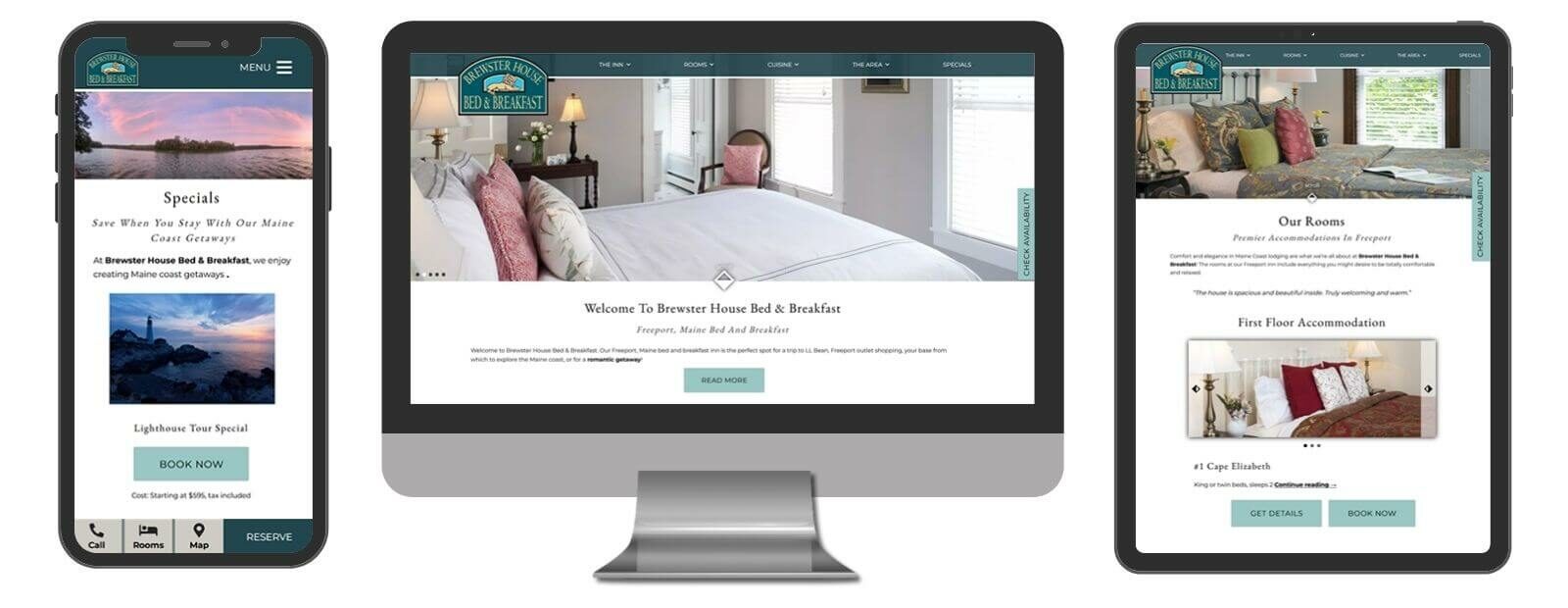
Brewster House Bed & Breakfast
Freeport, ME
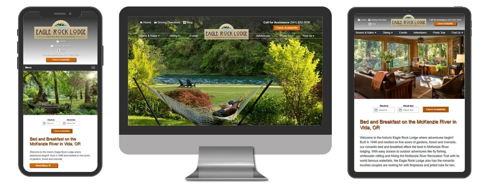
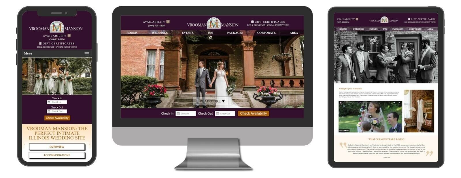
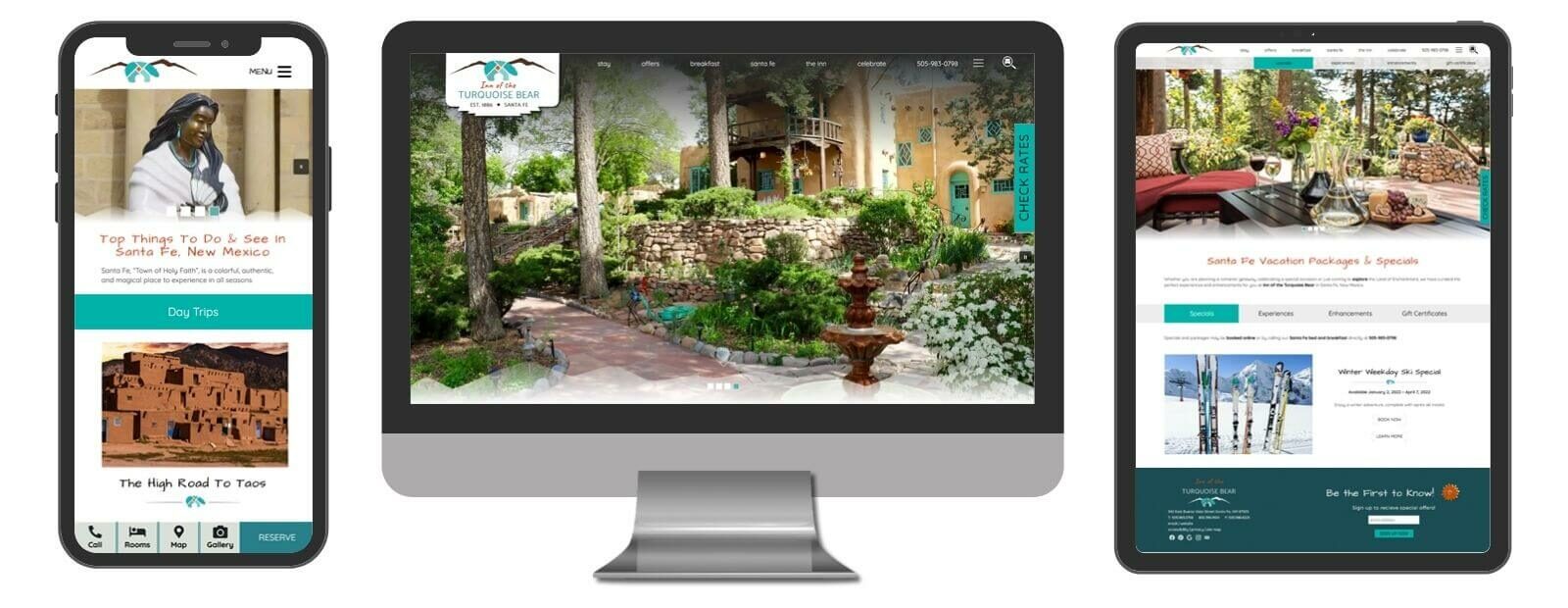
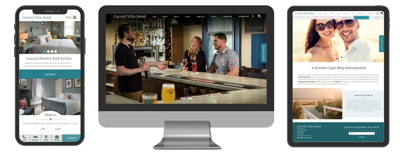
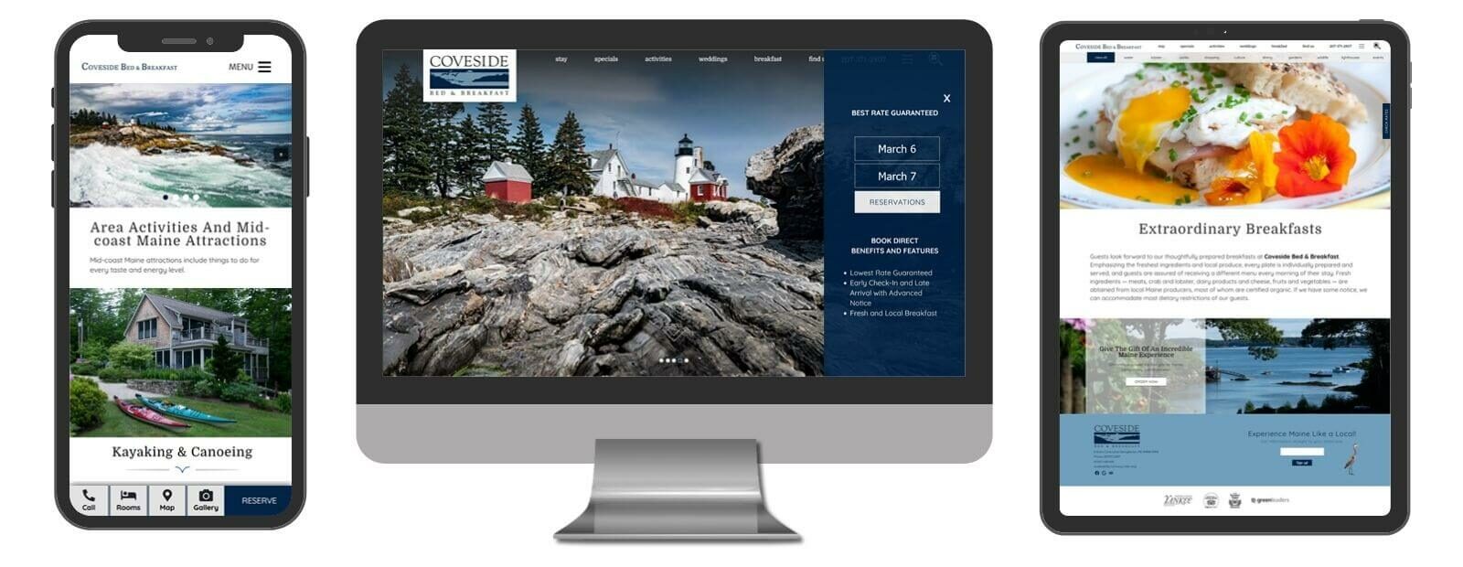
Premium Designs
Our responsive Premium Design provides elegant properties with a classic look and feel without the time requirement of a custom site. Custom designs are built from the ground up whereas our Premium design starts with a pre-designed theme, which we can then personalize to suit your needs without the extra time, work, and cost of a custom site.
The Premium includes 12 individual pages (additional pages may be added at an additional flat rate per page), and will sit on top of our “Core” code base that has been developed to meet Google, ADA, quick-to-load, and other quality guidelines. This “Core” is part of any design developed by Acorn Marketing, and YOU OWN THE SITE!
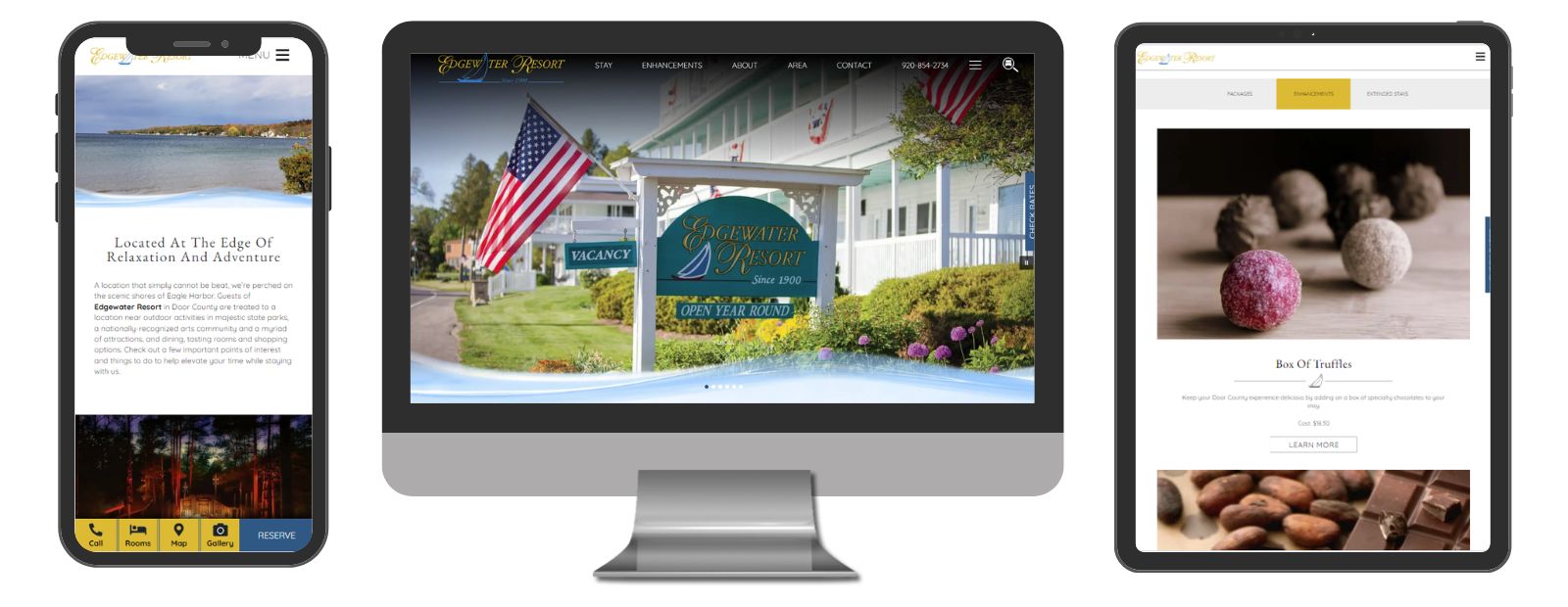
Edgewater Resort
St Ephraim, WI
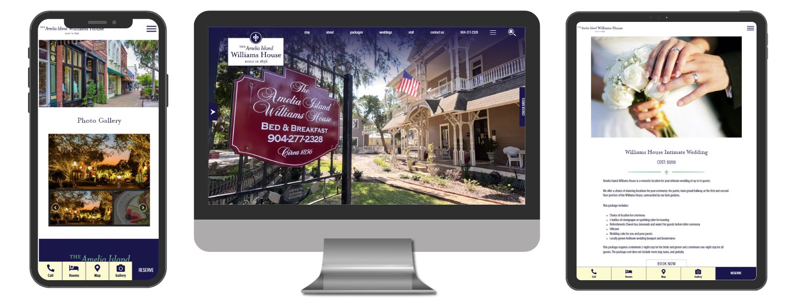
Amelia Island Williams House
Fernandina Beach, FL
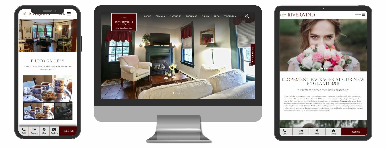
Riverwind Inn Bed & Breakfast
Deep River, CT
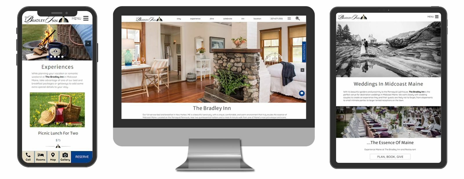
The Bradley Inn
New Harbor, ME
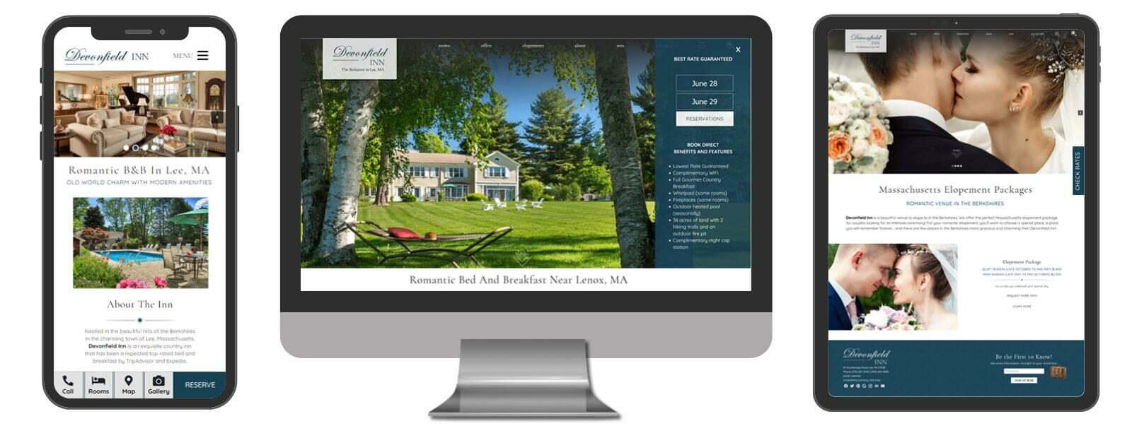
Devonfield Inn
Lee, MA
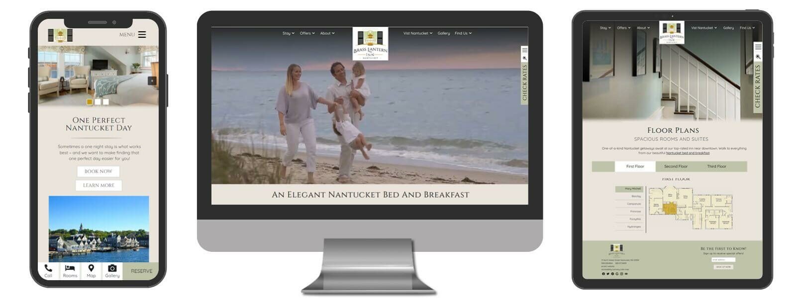
Brass Lantern Inn
Nantucket, MA
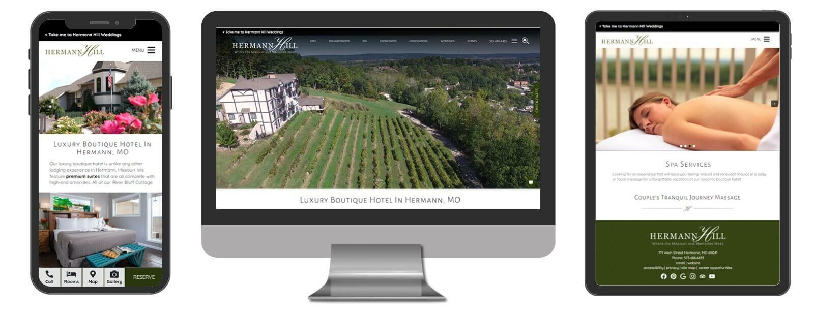
Hermann Hill
Hermann, MO
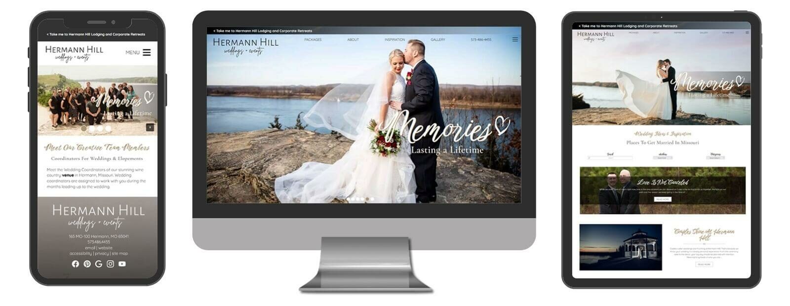
Hermann Hill Weddings
Hermann, MO
Inn of the Turquoise Bear
Santa Fe, NM
Carroll Villa Hotel
Cape May, NJ
Coveside Bed & Breakfast
Georgetown, ME
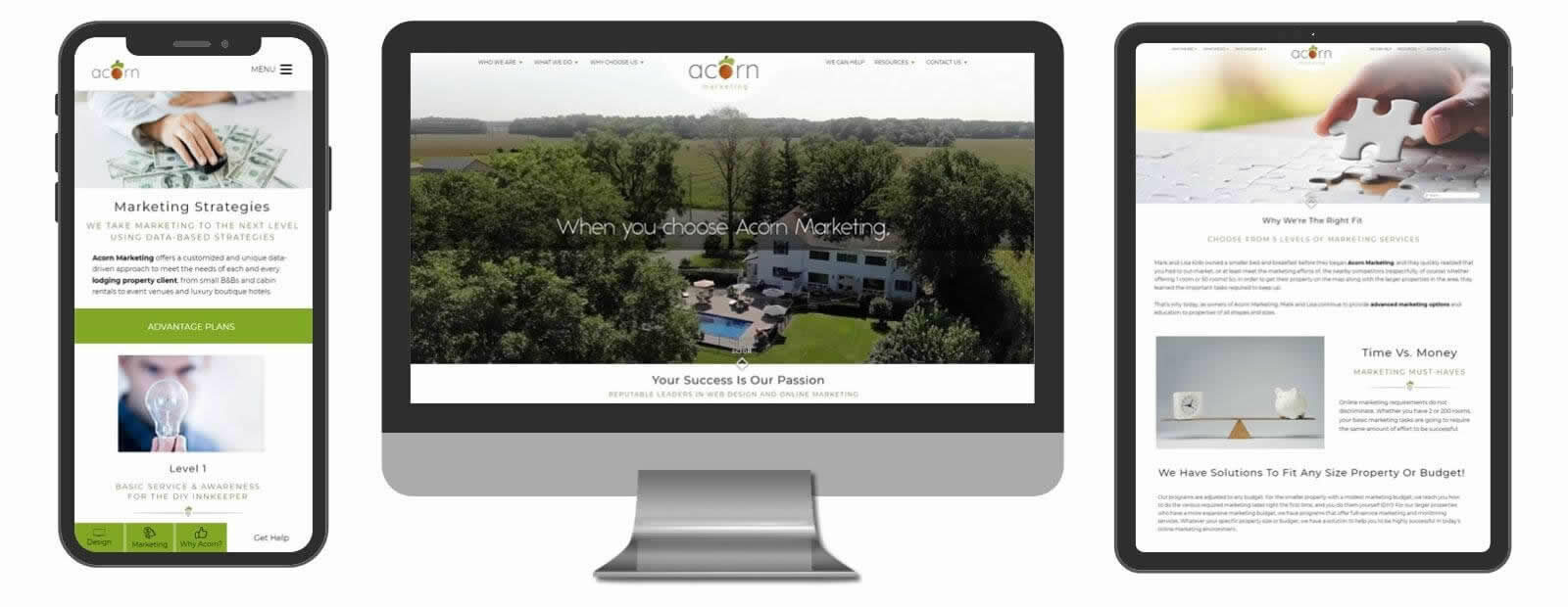
Acorn Marketing
Colorado Springs, CO
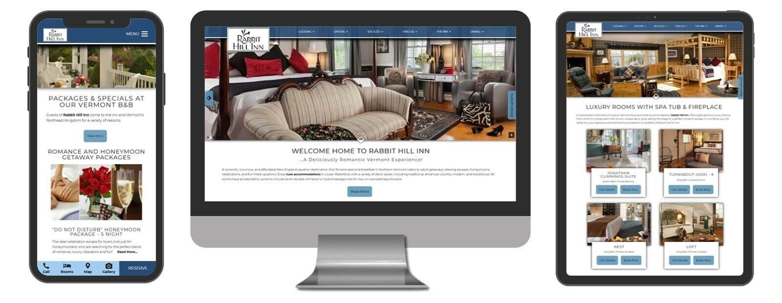
Custom Designs
A custom website does not necessarily equate to a fancy or complicated design with all the bells and whistles. On the contrary, a custom designed site is one that is built to YOUR specifications. Our Custom Design allows discerning clients the opportunity to turn their ideas and vision into reality. You convey the desired look and feel to our Design Team, and we will create a custom design from the ground up to match your brand’s vision and business goals. We can also incorporate desired elements from our existing design options (Standard, Deluxe, or Premium) to suit your needs. The choice is yours. Once you approve the overall design, we will build it implementing our “Core” code base that has been developed to meet Google, ADA, quick-to-load, and other quality guidelines. This “Core” is part of any design developed by Acorn Marketing, and YOU OWN THE SITE!
Association Designs
As a lodging association, we recognize that your needs and goals are different than those of a single property, which is why we offer website design specifically for associations. Each responsive Association Design we build is created from scratch according to your association’s needs – all within the realm of Google’s guidelines for a quality responsive design. Like all of our responsive website designs, your site will sit on top of our “Core” code base that has been developed to meet Google’s guidelines.
– Brigette Walters
Read Full Review